
I’ve been obsessed with a YouTube channel that analyzes flight mishaps. I’m not a pilot and don’t aspire to be, but I’m fascinated by the decision-making that unfolds before and during these flights, many of which end in avoidable tragedy. One term that comes up often is “falling behind the aircraft.” Loosely defined, it describes the moment when pilots become so overwhelmed by information during unexpected events that they literally stop flying the aircraft. To avoid this, pilots are taught a principle that’s easy to memorize: “Aviate, Navigate, Communicate.” In that order. Fly the plane first, then figure out where you are, then talk. The hierarchy exists for a reason—it keeps decisions clear during emergencies such as engine failures. I highly recommend this channel even if you’re not into aviation. They offer sharp lessons in scenario planning, communication, and decision-making under stress—skills that apply far beyond the cockpit.
Falling behind the process
“Falling behind the plane” is a term I can relate to. Having spent a large portion of my career in industrial control rooms, I’ve seen operators playing catch-up with a machine or process that’s become unstable due to mechanical failure, network outages, or any other unexpected event. Radios crackle. People rush in and out. Others sit in front of a dozen screens showing a mix of live video, flashing alarms, process values, and tables—often ambiguous, sometimes contradictory. It’s particularly bad when it involves a partial or complete redesign of a much older—and often much simpler—system that users have spent years working with. Even after hours of training, operators haven’t built the muscle memory to navigate a jungle of data and controls—many of which may have been moved, renamed, or repurposed.
I like to think of this scenario as the ultimate test of UI design. You can learn a lot just by standing there, watching operators go for what they think is the most logical path to execute an action—only to discover, with great frustration, it doesn’t work that way. It exposes every flaw in the user interface: difficult navigation, poorly written warnings and messages, unclear captions, cluttered metrics, inconsistent positioning of elements across screens, etc.
This happens even though industrial environments aren’t without guidance. Standards like ISA-101 encourage high-performance HMI design through restrained use of color, consistent layouts, and simplified visuals aimed at reducing operator overload. Alarm management frameworks like ISA-18.2 attempt to tame alarm floods by ensuring only the most critical alerts surface during abnormal situations. Some commercial platforms have added features such as situational dashboards and limited context-aware navigation. However, most user interfaces still offer a poor experience when the unexpected happens.
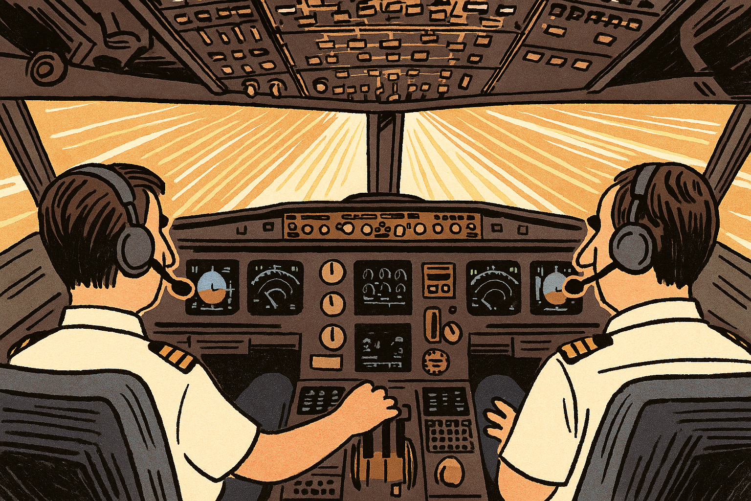
The Airbus Cockpit Philosophy
In the early decades of commercial aviation, cockpits were filled with analog gauges—each tied to a single system, requiring pilots to scan and interpret dozens of instruments continuously. Managing this array often required a third crew member, the flight engineer, whose job was to monitor systems like fuel, hydraulics, and electrical power. As aircraft became more complex, so did their interfaces. The shift toward digital integration began in the late 1970s and early 1980s, with aircraft such as the McDonnell Douglas MD-80 and Boeing 757 and 767 introducing electronic flight instrument systems (EFIS). These replaced selected analog gauges with cathode-ray tube (CRT) displays, allowing for more efficient and consolidated presentation of flight data. But it was Airbus’s A320, introduced in 1988, that marked the true turning point. Designed from the outset around digital systems, it featured a fully integrated glass cockpit, side-stick controls, and fly-by-wire technology, laying the groundwork for the two-pilot, screen-driven cockpits that define modern aviation today.
At the heart of Airbus’s cockpit design is a formalized philosophy that blends technical design with human-centered thinking. Known as the Airbus Cockpit Philosophy, it is guided by ten high-level principles aimed at enhancing safety, reducing workload, and supporting pilot decision-making. These principles ensure that pilots can always override automation, that controls are intuitive across a wide range of skill levels, and that the interface prioritizes clarity, consistency, and situational awareness.
Airbus applies color-coded displays, ergonomic panel layouts, and a “dark cockpit” concept—where lights are off when systems operate normally—to reduce visual clutter. Automation is integrated not as a replacement for the pilot, but as a tool that supports human judgment, with clear rules for delegation, feedback, and failover. Together, these elements are designed to minimize error, streamline communication, and adapt to real-time demands—creating a cockpit where design supports the operator at every turn.
Build for the Wrong Day
The Airbus cockpit wasn’t shaped by aesthetics or feature requests. It was shaped by constraints: limited attention, high stakes, and the need for fast, accurate decisions under stress.
Industrial UIs face similar constraints—but rarely the same design discipline. Many are built for steady-state operations, reviewed in calm conditions, and evaluated under normal use.
A sleek, fast, or polished UI developed using the latest and greatest tools isn’t necessarily a good UI. The real benchmark is this: how quickly can a trained operator troubleshoot or recover from an unexpected event using the interface? If the answer involves hesitation or workarounds, the UI has probably failed.
